 [Editor’s note: Leon Paternoster, Digital Manager and Deputy Head of IT at Suffolk Libraries, writes about how they designed their own library self-service software for a better user experience, at half the price.]
There were many factors informing our decision to design and build our own self-service kiosks for Suffolk Libraries, but the two major drivers were the need to improve our library users’ experience and a need to reduce costs. What was a pleasant, if not totally unexpected surprise, was that the former would have a positive impact on the latter.
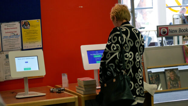
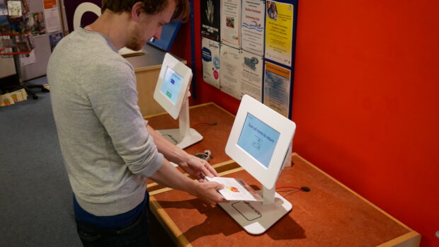
What we ended up with was a super-lightweight progressive web app that could run on off-the-shelf tablets, reduce costs by half, and provide a service that was familiar and intuitive for our library users. Getting there, however, required a pretty rigorous focus on simplicity throughout the design and development process.
Identifying user needs
From the outset, we did a lot of research and testing to see how library users interacted with both the existing hardware and software, and what they wanted to be able to do without library staff’s assistance. What had become clear from our research into existing kiosks, was not only their considerable cost, but also their complexity - we felt what they offered was often too over-engineered and wasn’t particularly user-friendly.

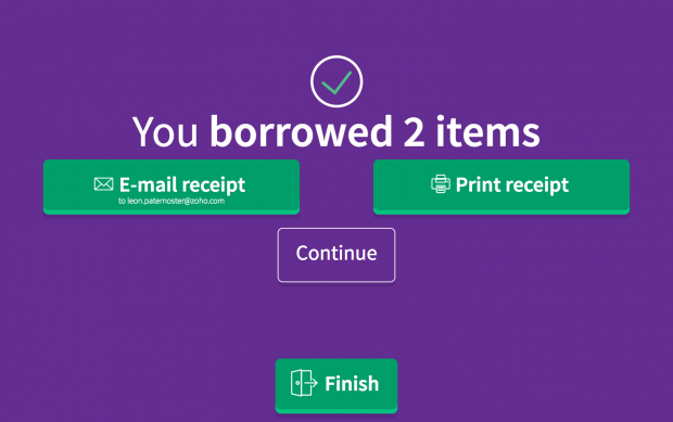
One of the challenges we faced in both the design and development process was that there’s no such thing as a ‘typical’ library user. They range from the very young to the very old, so we had to be wary about making assumptions about their familiarity with using a touchscreen, and the way anyone might expect them to work. Checking books in and out was a transactional task that required speed and simplicity above all. Too many on screen options, and too much additional functionality hindered swift progress, and increased the likelihood of confusion that needed a staff member’s intervention.
We took advantage of recent developments in web technology that allow a website to look and feel like a specialist app, even with offline functionality, but that is much easier to deploy, update and improve. Dootrix our development partners can make a change to the website remotely, and the changes appear simultaneously across all of the kiosks in all forty-four libraries, without any need for the Suffolk team to touch a button.
That simplicity also meant we could use relatively inexpensive and widely available tablets that were incredibly easy to swap in or out if needed. Demanding design simplicity meant that we got a friendly, intuitive and easy to comprehend user interface that genuinely made the check-out process quicker and easier. Children immediately ‘got it’, but it was also clear and, importantly, unthreatening for our older users too.

Design and build
Of course, the necessity to ensure value for money meant that, perhaps counter-intuitively, it was easier to commission and build our own software. Instead of presenting prospective developers with a long list of functional requirements, we asked them to demonstrate how they would build an app that would provide the important features of the user experience we’d identified in our research.
Our position as a divested service definitely made the procurement process a little easier, but we were lucky to have an extremely helpful and open-minded procurement officer at Suffolk County Council who ensured that it was a ‘light-touch’ process. It’s a truism that innovation is more often a result of a good, analytical process, rather than the process itself, and being very clear about what we needed from the start - informed by rigorous functional and user testing - we got exactly what we wanted and we got something that we think is better than what is out there at the moment.

Future plans
The Suffolk and Dootrix team are looking to make the all-in-one solution available to other libraries, so please get in touch if you’d like to discuss the possibilities of using it for your library service and if you’d like to arrange a demonstration.
Please note, this is a guest blog. Views expressed here do not necessarily represent the views of DCMS or the Libraries Taskforce